
Fire & Ice
Helping the sweets shop establish credibility, attract new customers, and stand out within a busy mall environment.
Project Type: Packaging and Branding
Brewing The Ideas
The Challenge: The visual identity lacked consistency and professionalism, making it difficult for customers to immediately recognize the brand or view it as a premium dessert destination.
The Goal: Establish a strong foundation for future growth and to develop a professional and recognizable brand identity
Grind & Explore
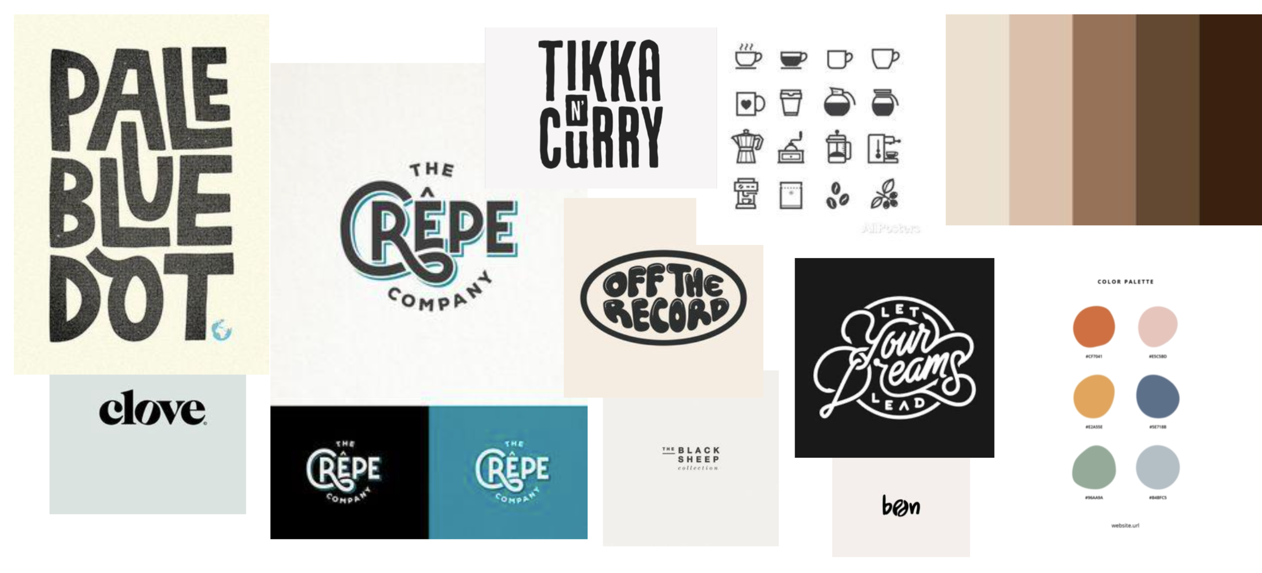
Mood boards, color exploration, and typography studies were used to develop a visual direction that reflected the contrast suggested by the Fire & Ice name. Concepts explored themes of warmth and coolness, indulgence and excitement, while maintaining a polished and approachable feel.
First Pour
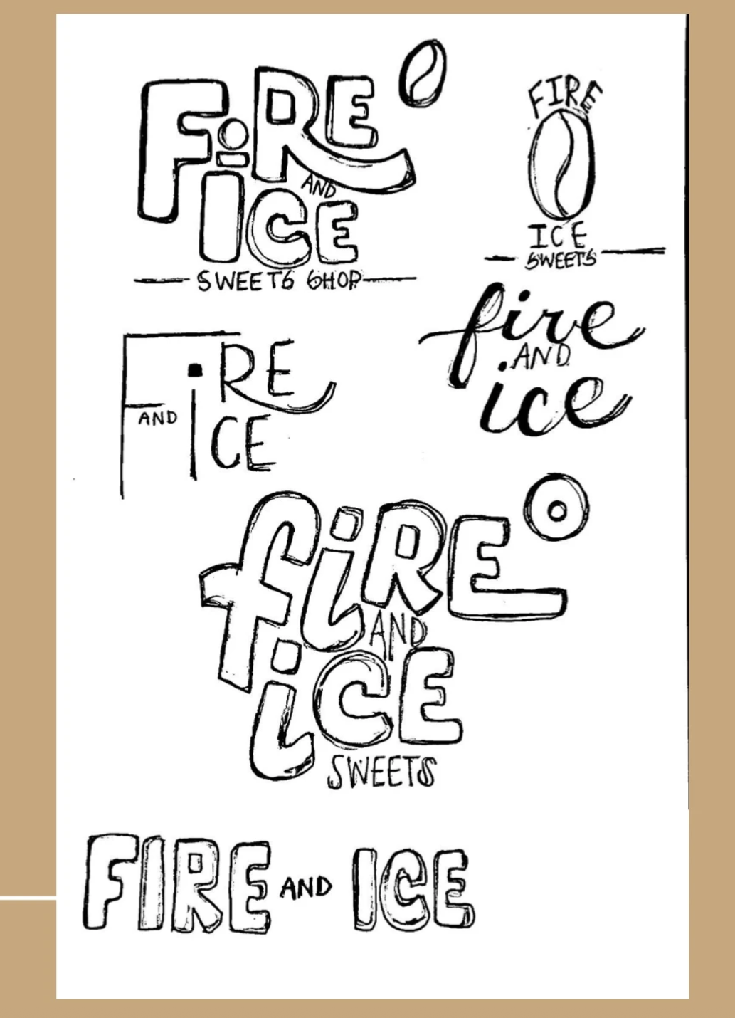
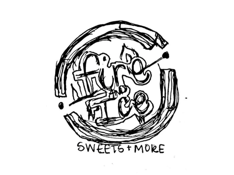
Multiple logo concepts and brand directions were created to test different ways of expressing the brand's personality. Explorations included icon development, typography pairings, color systems, and promotional applications.
Refine & Perfect
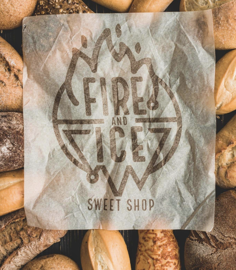
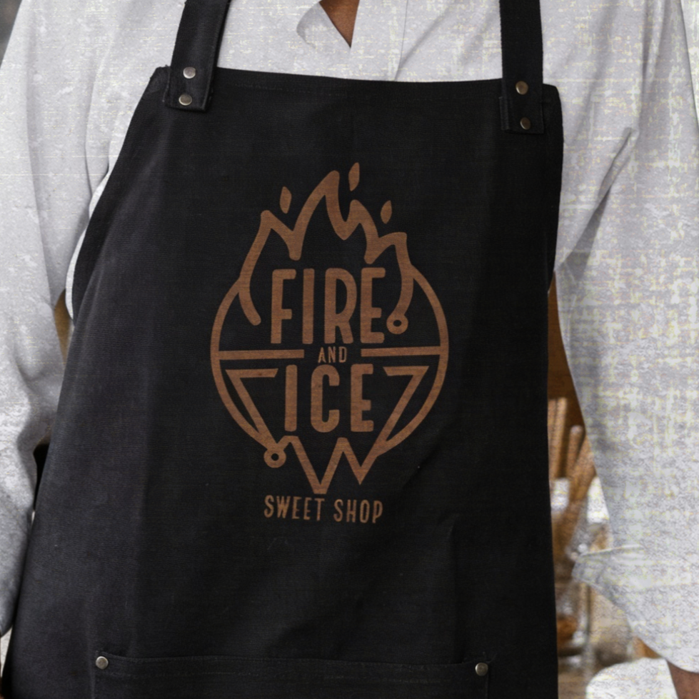
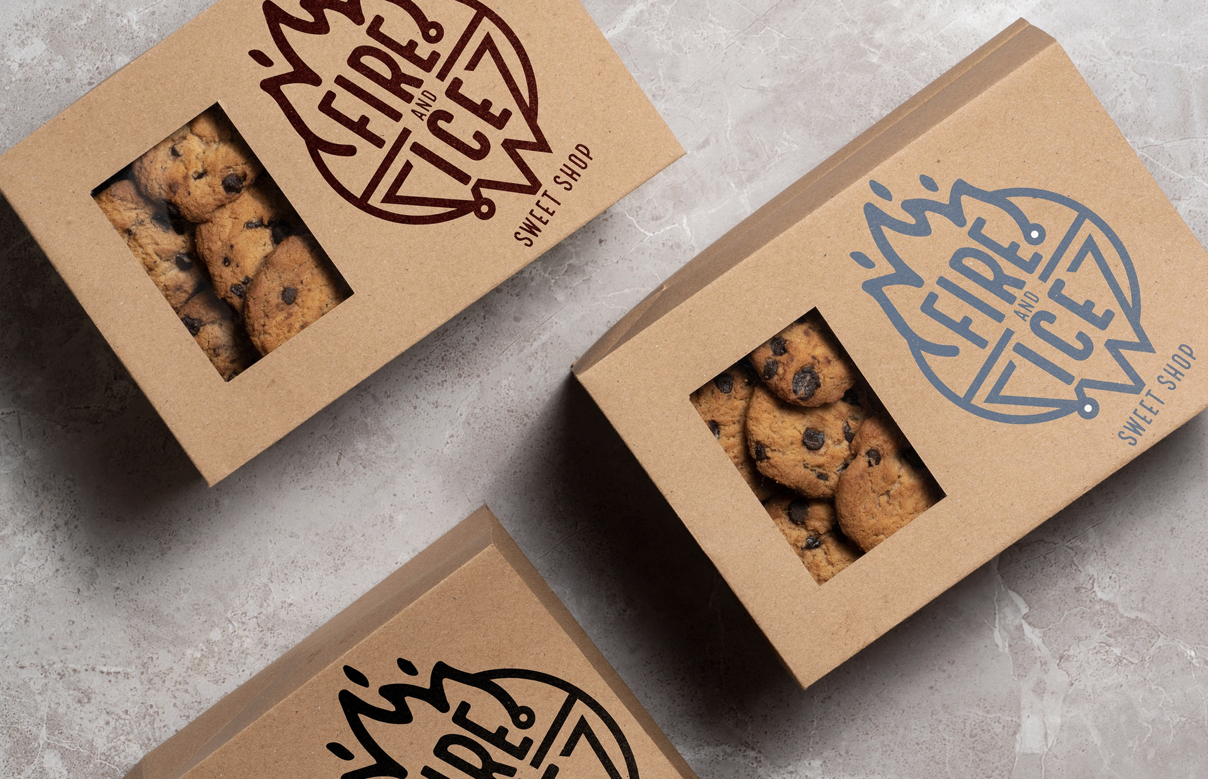
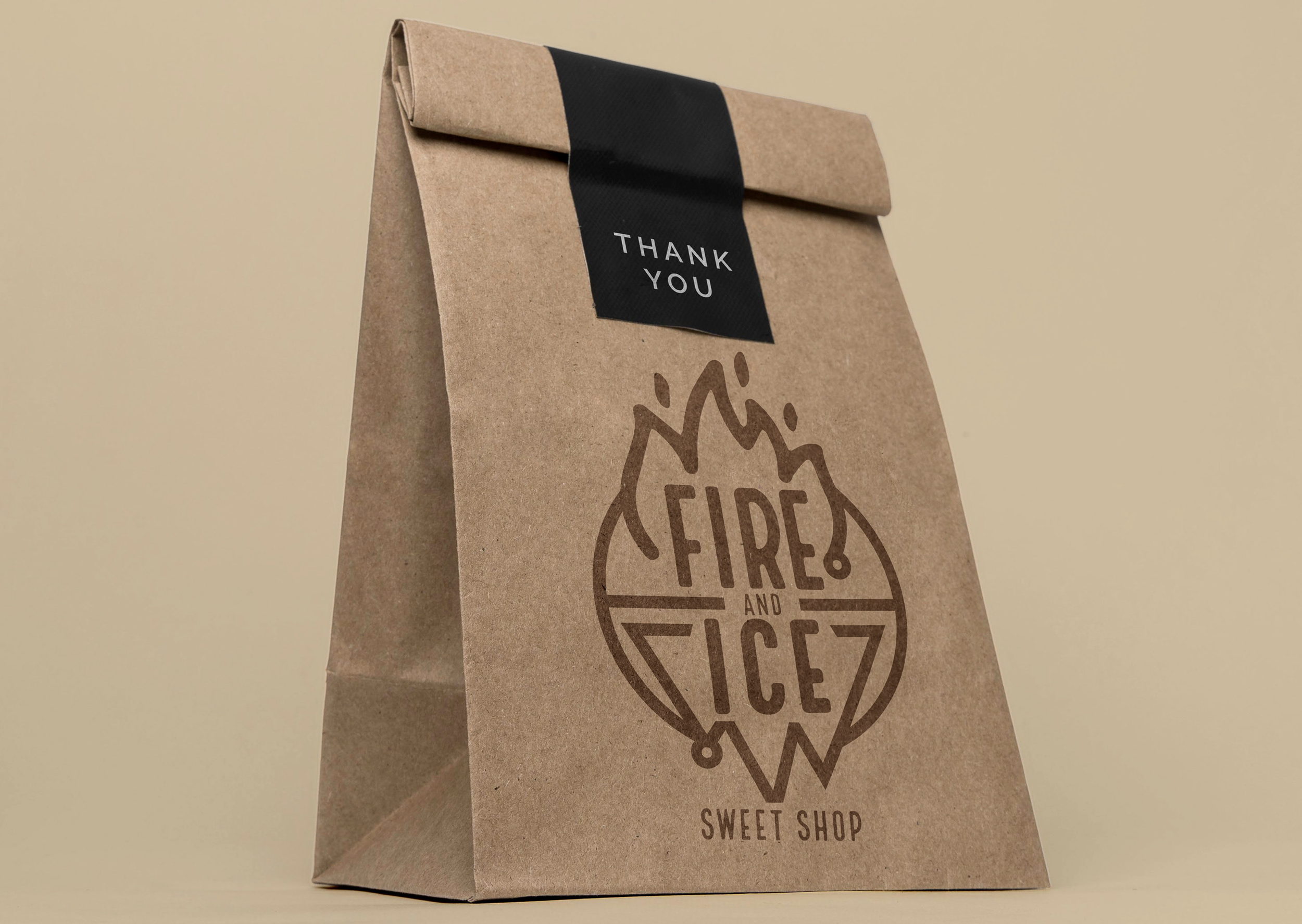
The final identity delivers a bold and memorable visual presence that helps Fire & Ice feel more established and professional. The cohesive brand system creates consistency for customers while preserving the fun and energetic nature of the business.