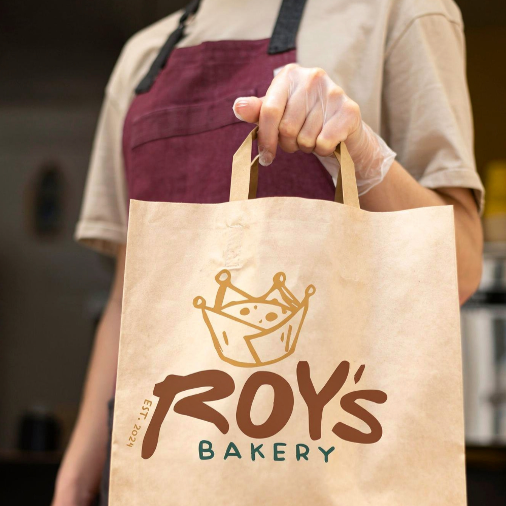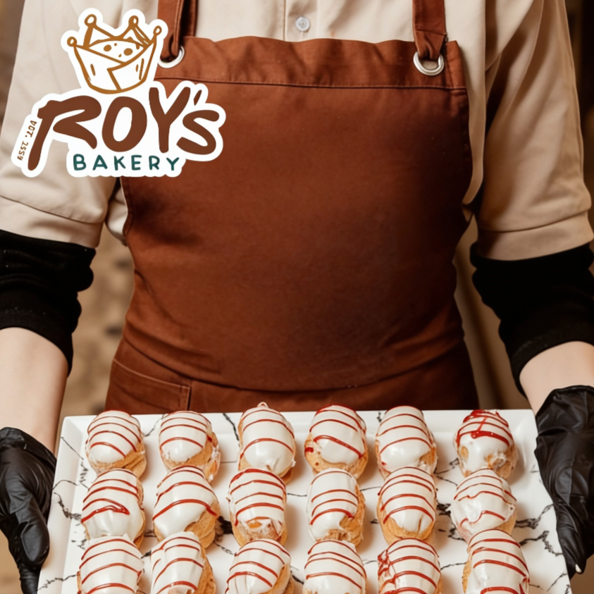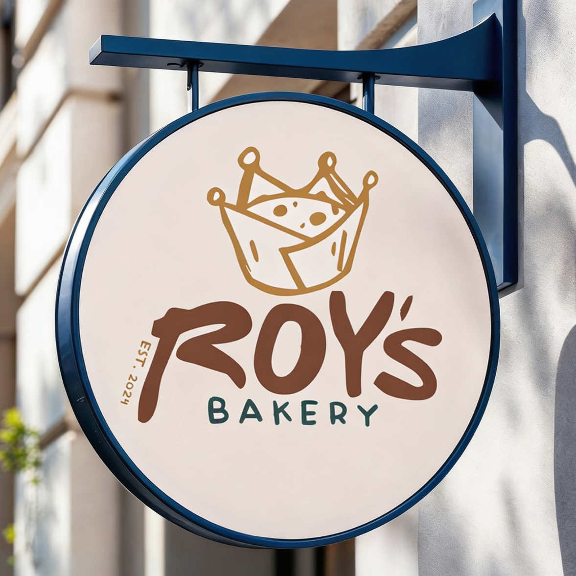

Roy’s Bakery
Create a bakery brand identity inspired by the visual style of Roy Lichtenstein.
Project Type: Brand Identity Design
Brewing The Ideas
The Challenge: This academic branding project required combining the visual language of Roy Lichtenstein with the needs of a bakery brand.
The Goal: The goal was to translate the artist's iconic Pop Art aesthetic into a cohesive branding system that felt both creative and appropriate for a bakery business.
Grind & Explore
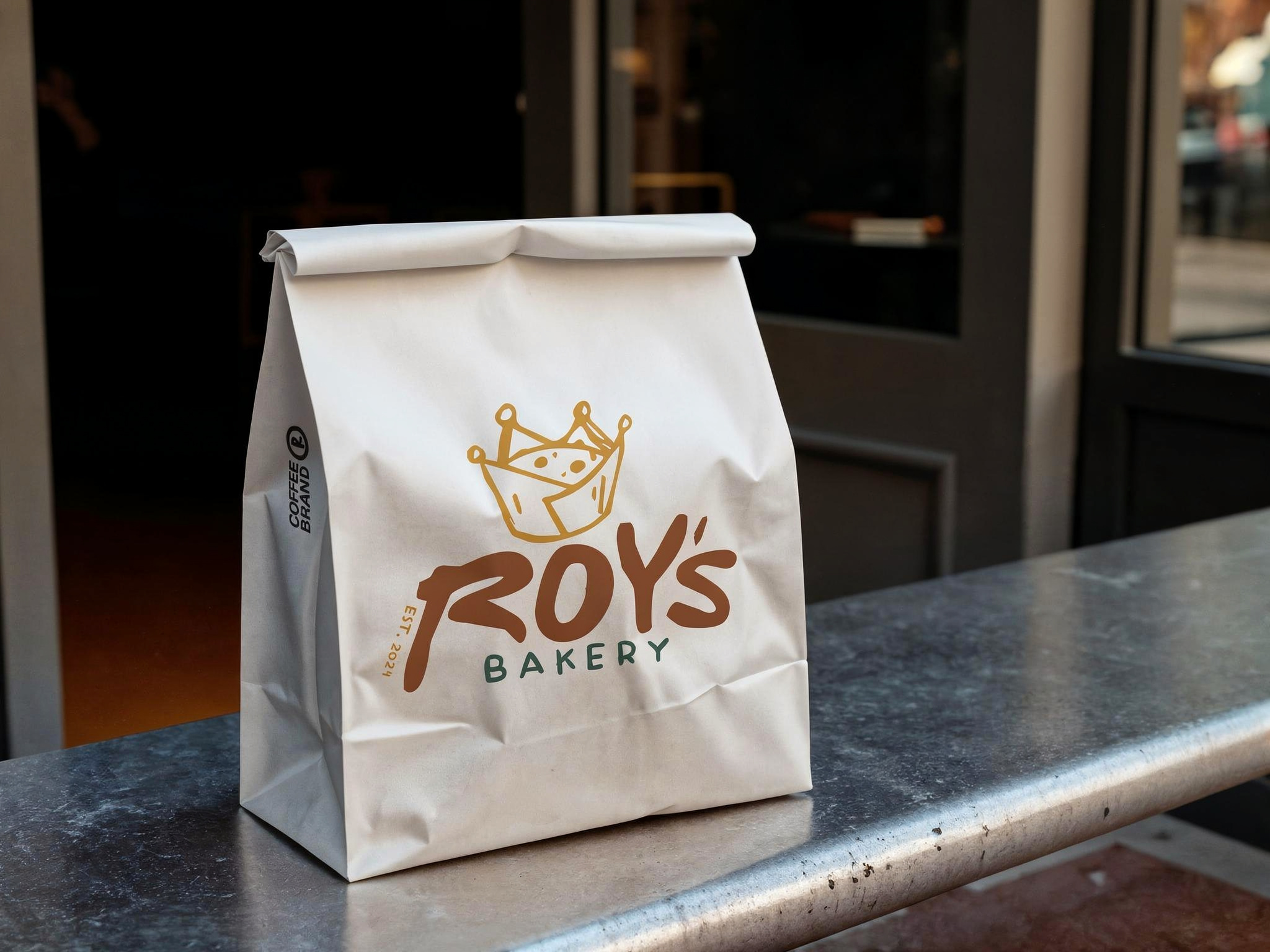
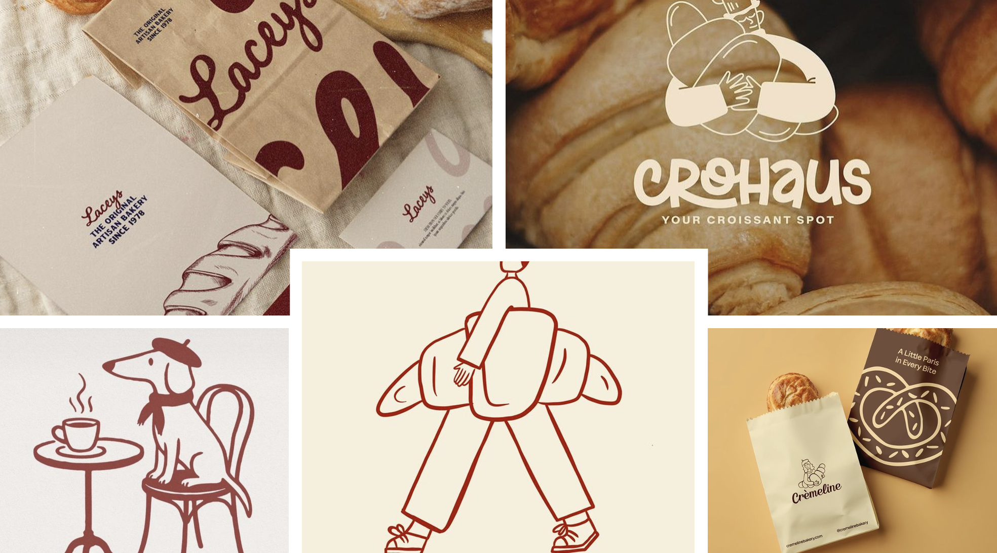
Mood boards, sketches, and visual studies explored how Pop Art aesthetics could be applied to logos, packaging, and brand assets. Color palettes, typography, and graphic elements were developed to reflect Lichtenstein's energetic style while supporting the bakery's personality.
First Pour
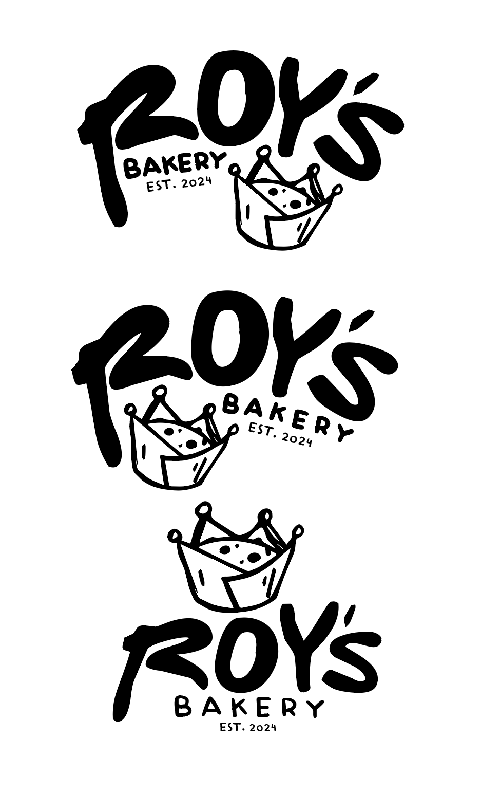
Initial concepts experimented with comic-inspired graphics, bold typography, and playful visual storytelling. Multiple logo directions were tested to ensure the identity felt both artistically inspired and commercially effective.
Refine & Perfect
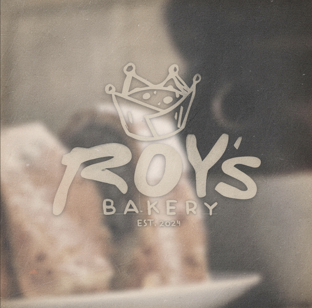
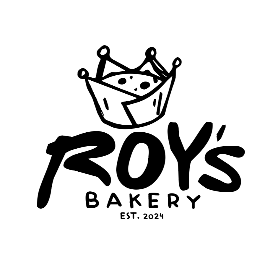
The final identity combines the vibrant energy of Pop Art with the welcoming nature of a neighborhood bakery. Through bold visuals, graphic patterns, and expressive branding elements, Roy's Bakery became a distinctive concept brand that celebrates creativity while remaining approachable and memorable.